Content is important, but strong visuals are even more important.
Photo essays, in particular, must attract a reader’s attention by capturing the reader’s eye. This is especially the case when there is a story attached to the photo essay.
At the New York Times Student Journalism Institute, I was expected to design a one-page photo essay package with a 600-word story.
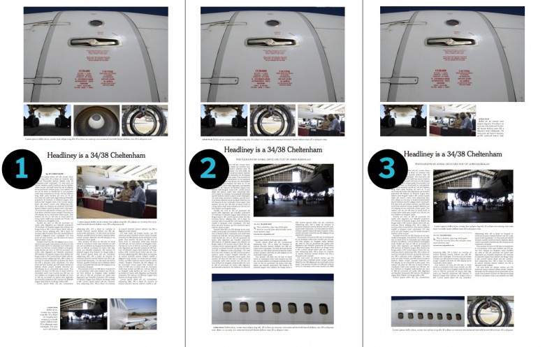
Version One
I began by designing version one: a dominant photo on the top and three smaller photos with wheels/circle shapes below it. I knew I wanted more white space on the sides and around the text so that the space could lead the eyes of readers into the story and they could read more about this plane graveyard where planes are stored and technicians try to repair them.
Version one didn’t impress me much. I felt as if there was something missing — or perhaps, there were too many small images on the page. Also, the two photos with circular images next to each other were not working for me — they needed to be separated.
Version Two
The second version was similar in that the dominant photo package stayed the same, except with different images. I changed the order of the photos to make the stronger photos larger. For example, I swapped the photo of the technicians with the darker, almost silhouette-like photo you see incorporated with the text. It’s nice to make sure that the people in images are a big enough size to see their faces, which is why I originally had the photo of the technicians larger. However, the photo of the plane in the garage was much nicer and so I decided to make it larger, or make it “pop” more.
I also added another image as a way to frame the page.
Since there is a large dominant photo at the top, the photo of the windows of the airplane would frame the page nicely.
Version Three
The third layout is a rough version of something else that I had in mind. I thought that the photo of the airplane windows in version two might be too big. So, I made the photo smaller. I really liked the composition of the photo of the engine cowl of a Boeing 747-200, so I tried to continue to incorporate it in the design by placing it as a small photo next to the bottom photo that I had made smaller
The Decision
I took a good look at all three of the page designs to find the one that would best attract readers and invite them into the package with the best use of white space.
I ruled out version one after I decided I was not a fan of the misalignment between the beginning of the text and the top of the photo that the text wrapped around. Also, before I had laid out that page, I was unaware about placing the bylines under the headline. By the second version, I realized it should go below the headline and decided to align the text and the photo.
The second version was much more appealing to my eye, so after taking a quick glance at option three and deciding that the second was the strongest of the three, I worked to improve the design and the version two you see now, was the winner.
The Winner
I chose version two after determining that the photos framed the page nicely and that the space on the sides of the text and the bottom image still invite readers to the story, although there is now less space between the text and the photos, on vertical sides.
I’m a fan of modular page design, so that’s evident in my designs, especially version two. I feel like modular page designs are direct and straightforward.
As someone once told me, white space is your friend. It sure is.

 During the Institute, students are working journalists supervised by reporters and editors from The New York Times and The Boston Globe. Opportunities for students include reporting, copy editing, photography, Web production, print and Web design, and video journalism. Institute graduates now work at major news organizations, including The Associated Press, The Los Angeles Times, The Washington Post and The New York Times itself, and dozens of midsize news organizations.
Vanessa,
Nice essay on the subtleties of page and photo editing. I also much prefer #2.
I know that aircraft bone yard, which was a hopping place during the disarmament years of the early 1990s. I could have grabbed some great souvenirs if only I had a few uninterrupted hours with a wrench and a large Chevy pickup.
Great job.Please let Don know that he’s missing all the nice spring days in midtown Manhattan. It’ll be hot and humid when he gets back.
Go Titans!